Famous Landscape Paintings: Photobook Design Ideas
- Published
- Reading time
- 6 min read
- Prepared by
- LiteGallery editorial team
Famous landscape paintings offer practical ideas for photobook design: use their composition, colour, scale and sense of depth to shape a coherent sequence of photographs.
A painting can suggest more than a palette. Its horizon, balance of open space and detail, or movement through the frame can inspire page layouts and transitions between images. This guide explores ways to translate those visual choices into a photobook without simply imitating a famous work.
| Painter or artwork | Visual cue | Photobook application |
|---|---|---|
| Albert Bierstadt | Epic, surreal landscapes | Reserve a full spread for a strong wide view |
| Ivan Shishkin | Detailed forest scenes | Alternate close details with wider woodland views |
| Edgar Payne | Vibrant, gestural brushwork | Plan colour shifts and visual rhythm |
| John Haberle, Torn in Transit | Oil on canvas; 36.8 × 51.4 cm | Consider how scale and composition affect a page |
What can famous landscape paintings teach photobook designers?
Famous landscape painters can teach photobook designers to make each spread serve a different visual purpose: Albert Bierstadt suggests giving a photograph room for its scale, while Ivan Shishkin and Edgar Payne offer distinct ways to build detail and rhythm. Treat their paintings as design references, not templates; let the photographs and their sequence determine the book’s structure.
Albert Bierstadt’s epic, surreal landscapes are a prompt to reserve a full spread for a photograph whose scale can carry the page. Ivan Shishkin’s detailed forest scenes suggest a different approach: move from close views of bark and branches to wider woodland photographs, so readers look closely instead of meeting repeated panoramas.
Edgar Payne’s vibrant, gestural brushwork offers a cue for page-to-page rhythm: use shifts in colour and the direction of marks to guide transitions between photographs. These are three distinct design references—Bierstadt for scale, Shishkin for changes of distance, Payne for visual movement—not recipes to reproduce. Build the sequence around what the photographs actually show.
How can a painting’s scale inform a photobook spread?
A painting’s physical scale can guide a photobook spread by showing how much visual weight a compact scene can carry. John Haberle’s Torn in Transit, dated ca. 1890–1895, is oil on canvas and measures 36.8 × 51.4 cm.; it belongs to the Smithsonian American Art Museum’s collection. Its modest dimensions are a useful reminder that a carefully composed scene need not be large to hold the reader’s attention.
Full spread or paired images?
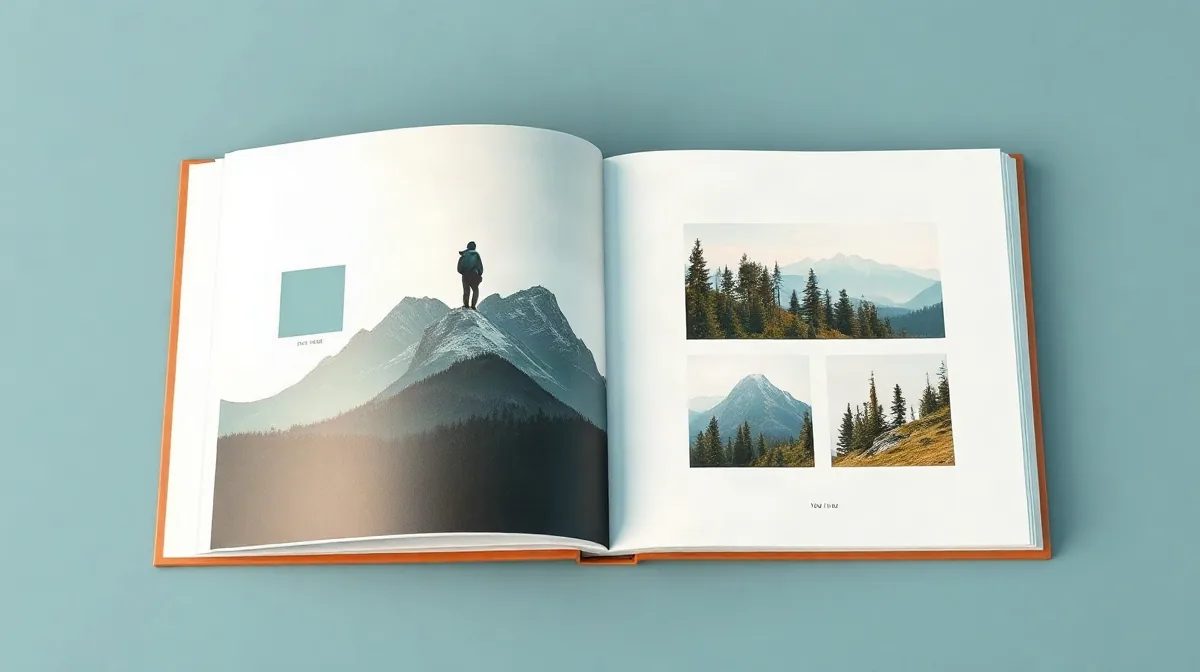
For a landscape sequence, compare one wide image across a full spread with a smaller landscape paired with a portrait. The first gives the scene room to suggest distance; the second brings human scale into direct contrast with the surroundings.
- Full-bleed landscape: Use it at the opening or close of a travel sequence, where its breadth can mark a strong transition.
- Landscape with portrait: Place the images together when the relationship between a place and a person matters more than an uninterrupted view.
- Quieter images: Use them between these larger moments to give the sequence visual breathing room.
How should colour and visual rhythm shape the sequence?
Let colour lead the sequence by tracking each photograph’s dominant hue across consecutive spreads, rather than forcing every image into one palette. Edgar Payne’s vibrant, gestural landscapes offer a prompt for looking at colour as movement: a warm sunset followed by a cooler forest frame can make a purposeful turn, provided the change is paced so the reader feels the shift rather than a break in the story.
Ivan Shishkin’s detailed woodland scenes suggest varying the scale of the photographs within a forest sequence. Set a close view of bark, leaves or branches beside a broader woodland frame; that change gives the eye a new point of entry while keeping both images in the same landscape story.
Use expansive landscapes as pauses
Albert Bierstadt’s epic landscapes can serve as visual pauses, giving a chapter a sense of arrival after tighter or more intimate views. Reserve a full, expansive spread for a meaningful transition or destination instead of repeating that scale every other spread; its impact depends on contrast with the images around it.
How can a grid and text pages support a travel story?
Grid, portrait and text
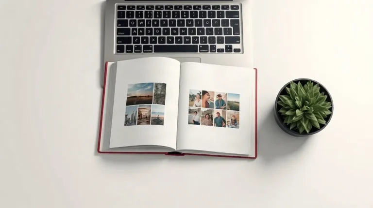
A consistent grid can align landscape photographs of different proportions while preserving their original crops, and selective full-page text can separate locations or signal a change in mood. In a travel photobook, the grid gives varied images a shared structure; a text page gives the journey room to pause.
Pair one large landscape with a portrait to establish a clear relationship between the breadth of a place and a person within it. A grid of smaller photographs works differently: it can gather details or variations from one location without making any single view carry the whole story.
- For varied photographs: Use a consistent grid to align different proportions without forcing every image into the same crop.
- For a change of place or mood: Insert a full-page travel passage selectively as a transition.
- For scale or detail: Pair a large landscape with a portrait, or group smaller photographs from one place in a grid.
- For a landscape-format book: The MILK Premium Landscape Photo Book is one named option for preserving travel photographs; choose the format to suit the images and their intended sequence.
When does painterly inspiration become a photobook design mistake?
A landscape painting becomes a photobook design mistake when its visual drama dictates every spread, rather than helping the photographs tell their own story. Use a Bierstadt-inspired full-spread image only when a photograph earns that space; if every frame gets equal prominence, the book loses a sense of hierarchy.
Where the reference stops working
A strict grid can make a sequence feel flat when a broad vista, a forest detail and a portrait carry different visual weight. Keep alignment cues consistent, but vary image size and placement so each spread responds to its photographs—not just to a template.
Painterly colour is a reference, not an instruction to recolour the trip. Shishkin’s detailed forests or Edgar Payne’s gestural brushwork can suggest attention to texture or movement, but a forced palette risks making the photographs feel unlike the place and light they record.
- Full-bleed landscape: Reserve the large spread for a photograph with enough detail and impact to hold it.
- Grid: Use consistent alignment, then adjust scale to distinguish a vista from a close detail.
- Generated mock-up: Text-based image generation still faces challenges related to randomness and limited controllability. Check each result rather than treating generated imagery as a dependable layout proof.
Frequently asked questions
Which famous landscape painters are useful references for a photobook?
How do I make a landscape photo feel expansive in a book?
What is a useful example of a painting’s physical scale?
Should I use a grid for every photobook spread?
What this piece draws on
- samuelearp.com — “11 Best Art Books For Painting Landscapes”
- MoMA — “Five Artist-Publishers Who Are Changing the Photobook Landscape | Magazine”
- mixtiles.com — “Photo Books – Photo Book Layout Ideas: 25+ Smart Spreads to Inspire – Mixtiles – Blog”
- artifactuprising.com — “How to Organize Photo Albums: 20+ Photo Book Layout Ideas”
- milkbooks.com — “The Most Popular Photo Book From Our Range”